















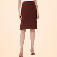

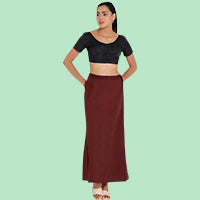

You drape your favourite saree, step into good light… and suddenly the inskirt band, side seam or colour line is visible. A simple saree petticoat colour guide can save you from this last-minute stress before a wedding, office event or pooja.
The right petticoat shade depends on your saree fabric, print, lighting and how sheer the drape is. Shops like Vnhnaiduhall see this every day in trial rooms, so here’s what actually works in real Indian conditions – bright sun, tube lights and flash photos.
Start With Fabric And Transparency
Before matching shades, stand in front of a window and check how transparent your saree really is. This is where any saree petticoat colour guide has to begin, because chiffon behaves very differently from thick cotton or Kanjivaram silk.
Lay the saree over your hand or a white pillowcase. If you can clearly see your skin or the print underneath, treat it as a transparent or semi-transparent saree and choose your petticoat more carefully.
Very sheer chiffons, georgettes, organzas and tissue sarees highlight every petticoat seam and colour change. Medium-sheer crepe, lightweight satin, soft silk and linen hide small mismatches but not stark contrasts. Heavier cottons and Kanjivarams forgive more, but pale colours still need thought.
Safe Petticoat Colour For Transparent Saree Drapes
With very sheer sarees, guessing from the hanger is risky. Think about the petticoat color for transparent saree in terms of skin tone and base shade instead of trying to follow every single print colour.
For most Indian skin tones, four shades cover almost every transparent saree in your wardrobe:
-
Skin-Neutral Beige: Closest to your own undertone; melts under pastel and nude sarees in photos.
-
Soft Gold Or Champagne: Works under off-white, cream and pale festive sarees without looking dull.
-
Light Coffee Brown: Ideal under darker nets, copper tones and earthy printed chiffons.
-
Warm Off-White: Better than stark white under pale cotton and linen sarees for day events.
Avoid very bright white under slightly sheer sarees unless the saree itself is a strong opaque white. That sharp contrast can make the inskirt line pop in flash photography, especially against deeper complexions.
Matching Petticoat To Saree Colour The Right Way
After transparency, the next question is simple: how close should you go when matching petticoat to saree? Exact matching is not always ideal, especially when prints or ombré dyes are involved.
As a rule, match the petticoat to the saree’s base colour, not the border or pallu. For example, with a navy saree and bright pink border, pick a navy or deep ink-blue inskirt so the drape looks continuous.
When you shop online or in store, try to:
-
Identify The Dominant Colour: Stand back and see which shade covers most of the pleats and lower half.
-
Go One Shade Darker: A slightly deeper petticoat hides seams and curves better than an exact pastel match.
-
Match Undertone, Not Just Hue: Cool pink sarees like a blue-based pink petticoat, while warm coral suits orange-based inskirts.
When you are building a basic saree wardrobe, keep 3–5 neutral inskirts ready to cover your most-used colour families so matching becomes quick even without a detailed saree petticoat colour guide.
Saree Petticoat Colour Guide For Prints And Special Drapes
Printed sarees and contrast borders behave differently to solids, so a focused saree petticoat colour guide really helps. The wrong base can make a floral print look muddy or create visible colour blocks beneath the drape.
For bold florals and geometric patterns, choose a petticoat close to the background colour, not the loudest motif. This keeps the overall fall clean without breaking the print at the hip line.
How To Read An Inskirt Colour Chart In Stores
Many counters hang a basic inskirt colour chart showing standard shades from white and ivory to bottle green and maroon. Use this to see which swatch disappears most under a small section of your saree.
Place the saree over the chart and slide it until the base looks even. This quick test usually gives a better answer than relying on memory of your wardrobe shades.
Special Cases Like Pastels And Ombre Sarees
Pastel organza and ombre-dyed sarees are unforgiving. In these cases, a nude or beige tone close to your skin helps the colour gradient look natural, instead of cutting across at the waist with a darker band.
For half-and-half sarees, match the petticoat to the lower half colour. That is what shows through the pleats and sets the main mood of the drape, something stylists at Vnhnaiduhall often suggest in store.
Quick Fitting Room Tests Before You Buy
Even after reading guides, the real test happens in normal lighting. Before you pay for a new saree or inskirt, do two small checks that stylists in stores like Vnhnaiduhall keep going back to.
First, try the saree over the petticoat and stand side-on under a tube light. Look for three danger signs: a visible waist band line, pocket or seam shadows, and colour change where the saree double-folds at the pleats.
The One-Minute Inskirt Colour Check At Home
At home, you do not need a formal inskirt colour chart. Drape the saree over your chosen petticoat, then switch between yellow and white light if possible. What disappears in warm light can suddenly show in cool white LEDs.
Walk a few steps and sit down. If you can see the petticoat bunching or changing shade around the knees, it is either too short, too bulky, or the colour contrast is too strong for that saree.
Balancing Comfort, Climate And Colour
Colour is not the only factor. In peak summer or monsoon, a dark rayon inskirt under a sheer pastel saree can show sweat patches. Lighter cottons in skin-close tones are safer and more breathable for long functions or office wear.
When you refresh your innerwear drawer, review blouses and bras too so straps and bands stay discreet under your favourite drapes.
Everyday Wardrobe Planning And Care
Once you understand how colour behaves, plan your wardrobe so your favourites are always washed and ready. For daily office wear, many women rotate just three or four inskirts across cotton, linen and soft silk sarees.
To make that rotation work, think in colour groups:
-
Light Neutrals: One beige or nude and one warm off-white for pastels and light cottons.
-
Deep Tones: One black or charcoal and one dark maroon/brown for deep silks and darker chiffons.
-
Occasion Specials: One soft gold or champagne for reception sarees and festival organzas.
Wash petticoats with similar colours and avoid harsh bleach, which can shift the shade slightly over time. Even a small tone change can start showing through very sheer sarees, so retire old, faded inskirts to house wear.
Conclusion
Picking the right inskirt shade is less about guesswork and more about a simple system. With this saree petticoat colour guide, you focus on fabric transparency, base colour and real-life lighting instead of last-minute panic in front of the mirror.
Once you build a small set of well-chosen petticoats from brands like Vnhnaiduhall, your sarees fall better, look neater and feel more comfortable through long Indian weddings or workdays. Start by testing your sheerest saree this week and add the one shade your wardrobe is missing.
Frequently Asked Questions
Q1. How Do I Use A Saree Petticoat Colour Guide For Net Sarees?
Ans: Treat the petticoat as the main base garment. Pick nude, beige or soft gold near your skin tone and the saree’s base shade. Avoid stark white or black, which create blocks and highlight seams, then take a quick trial photo under normal room light.
Q2. What Petticoat Colour For Transparent Saree Looks Best In Photos?
Ans: Skin-neutral beige usually photographs best for transparent sarees. Match depth to your complexion, then take one photo in tube light and one in warm light. If seams and pleats disappear in both, you have a safe choice for most occasions.
Q3. Should The Petticoat Always Match The Saree Exactly?
Ans: No. The petticoat should blend, not perfectly match. Aim for the dominant base colour or a slightly darker shade. This hides seams and avoids the inskirt looking like a separate block, especially under printed, ombré or half-and-half sarees.
Q4. How Do I Choose One Inskirt Colour For Many Sarees?
Ans: If you want one hardworking inskirt, choose a medium beige close to your skin tone. It suits many pastels, light nets and soft georgettes. For deeper sarees, add one more petticoat in rich brown or maroon so contrasts and lines stay softer.
Q5. Does Petticoat Fabric Matter As Much As Colour?
Ans: Yes, fabric matters too. Stiff materials can show as ridges under sheer sarees even when the shade is right. Softer cottons and blends sit flatter, move with the drape and feel more breathable for long weddings, office days or travel.
To shop the perfect saree petticoats, visit: https://vnhnaiduhall.com/collections/saree-petticoat-skirt